Dask Dashboard
Dask has a built-in dashboard that shines a light on how the tool is utilizing threads for parallel computation. It gets updated real-time as executions take place, so you can monitor your tasks as they happen. This article covers how can you access Dask Dashboard and then goes through each graph of status page, discussing how to understand and use it. The method for accessing the Dask dashboard depends on how you are running Dask.
Accessing the Dask Dashboard
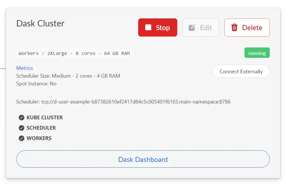
The most common situation when using Saturn Cloud is that you have a separate Dask cluster connected to a Jupyter Server. In this situation you can open the dashboard directly from the Saturn Cloud UI by clicking the Dashboard link on the Dask card of the resource:
Local Dask Clusters on Jupyter Servers
If you are running Dask locally within a Jupyter server, rather than on an attached Dask cluster, the instructions are different.
First, open JupyterLab for the Jupyter server resource. Get the URL of the JupyterLab window from your browser and replace /lab/* with /proxy/8787/status. For example, your Jupyter URL might be:
https://j-abc-proj.community.saturnenterprise.io/lab/workspaces/examples-cpu
Then your dashboard URL would be:
https://j-abc-proj.community.saturnenterprise.io/proxy/8787/status
Details of the Dask Dashboard Components
Task Stream : The task stream lets you view tasks across threads. Each row represents a thread and each rectangle represents a task. The colors in these rectangles is for the kind of operation being performed, for example green may stand for ‘sum’ and purple may stand for ‘fitting a model’. The white space between these operations is thread’s idle time. A red rectangle represents communication between threads.
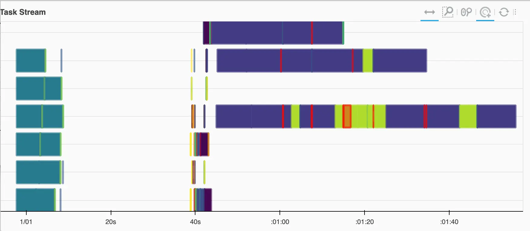
Notice in image above, one of the tasks is colored as green but also has red around it . This means that transferring of data and computation of a task are being preformed in parallel. Lots of red and white in task stream indicates that hardware is not being used effectively since the threads are idling while waiting for data to transfer. In that case you may want to make some changes to your computations or resources.
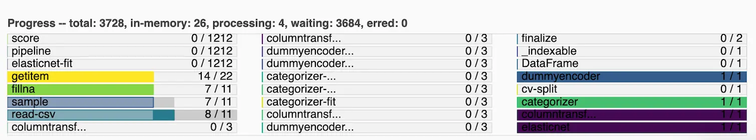
Progress Bar: The progress bar part of the dashboard indicates how a set of tasks is progressing. Each task is one horizontal bar on this part. Notice that there may be multiple rows of bars. The color coding for each type of operation aligns with the same colors from the task stream . Each progress bar can have 3 components:
- The leftmost part is transparent colored. Transparent colors indicate that completed tasks have been released from memory.
- In middle, the solid coloured parts indicate that these tasks are in-progress hence are in memory.
- The dark gray you see on the right side of bars tells us that these tasks are ready to run.
If you see lot of dark gray in progress bars that may mean that so many tasks are waiting to be run because there are not many threads available to run them. This may be solved by making modifications to your Dask cluster configuration.
Bytes Stored: The bytes stored part of the dashboard tells us the amount of RAM taken by each worker . In this example below, each line corresponds to a worker. We can see that each worker is taking around 6 GB of ram. The total memory consumed by all workers (in this case 18.26 GB) is displayed at top of the chart.
![]()
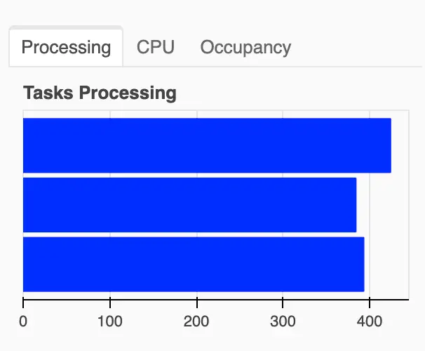
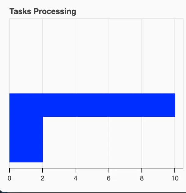
Task processing: This graph represents processing of tasks which were in ‘ready to run’ state (these are the tasks represented by dark gray in the progress bar section). This graph tells how tasks are being processed across each worker. In image on left hand side, you will notice that each worker is running around 400 tasks. This indicates a healthy and equal distribution of tasks amongst workers.
In image on right hand side you will notice that task distribution is unequal. This happens when all workers are not been optimized fully or computations are about to end hence each workers have finished their tasks or are almost finishing.
| All workers in action | Most workers in idle state |
|---|---|
 |  |
